Typography-led identity
45 stories
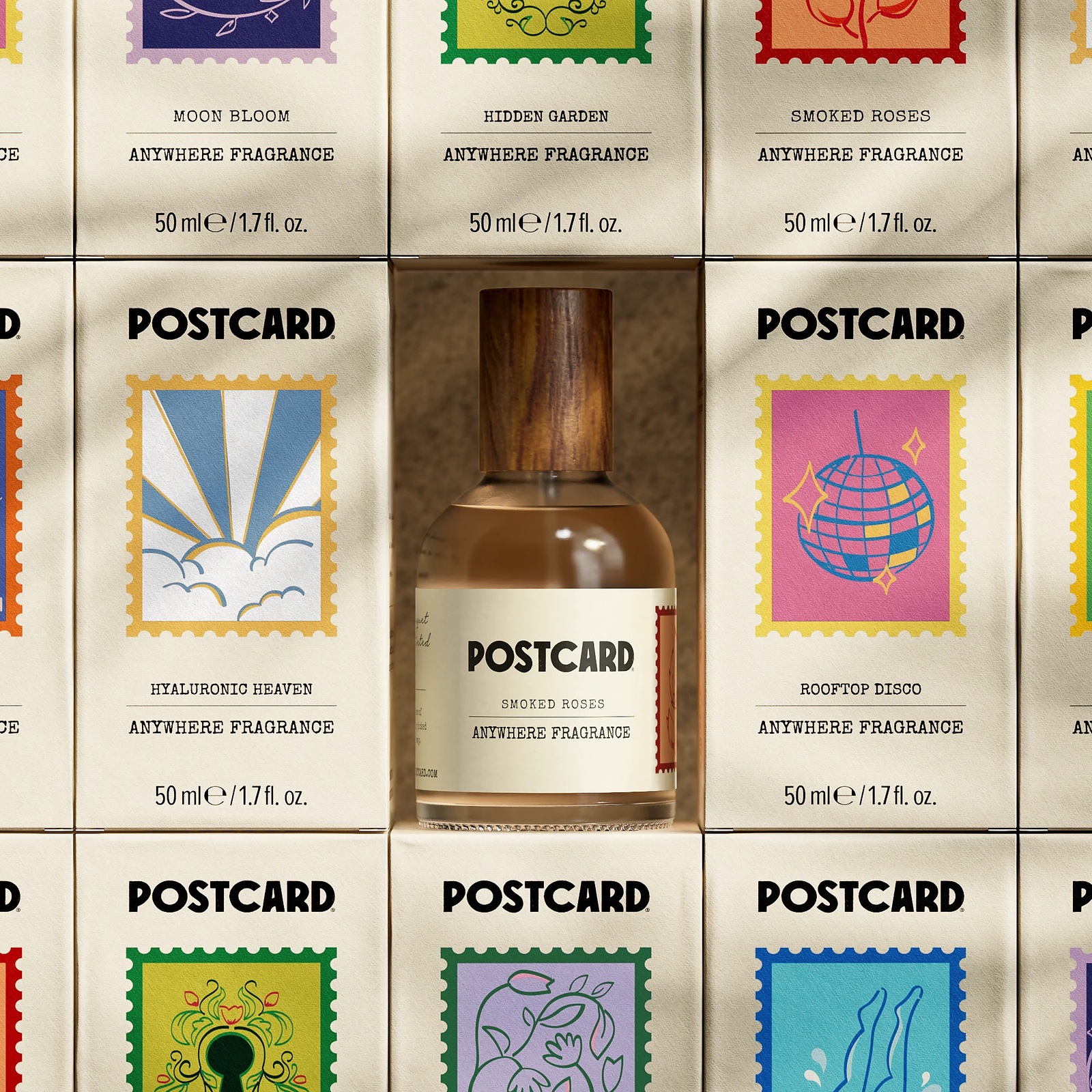
AbduzeedoBest of the Week: Custom Serifs, Fluted Glass, and Print
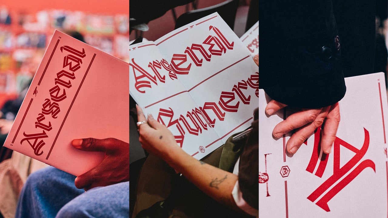
Fast Company DesignArsenal’s new blackletter font is a tribute to a star player Arsenal’s new gothic font is a modern take on black letter. It’s part of a larger multi-font branding strategy for the 140-year-old English football club.
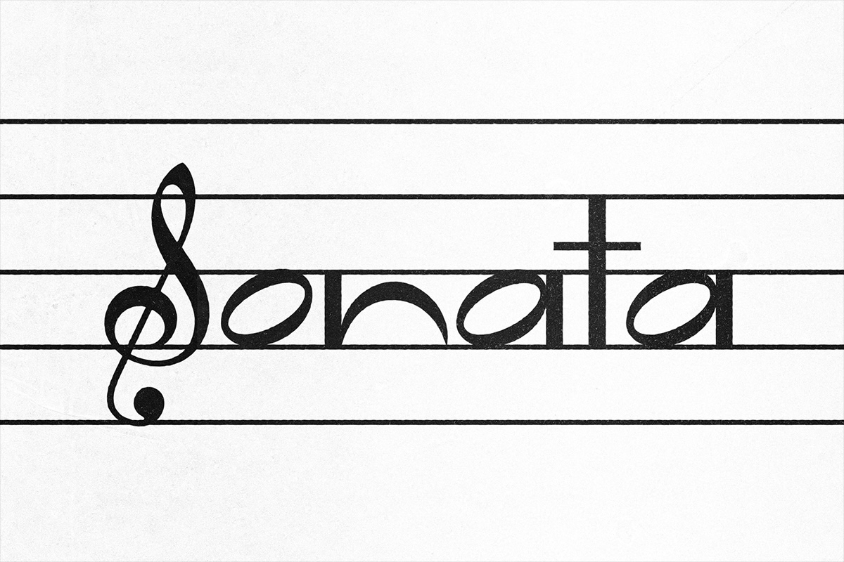
SlantedSonata Sonata is a display typeface designed by Rosa de Vera that is inspired by musical notation. The typeface explores the parallels of graphic design and musical composition, and how design can be a way…

I Love TypographyFont Faces: Stefan Hattenbach Read the book, Typographic Firsts Stefan Hattenbach was born in Stockholm, Sweden, in 1961. Although he’s moved around a lot, with longer stays in Budapest (1993–94) and San Francisco (2005–06), he’s…

AlphabettesType + Lettering

I Love TypographySteven Heller’s Font of the Month: Ege Basalt Read the book, Typographic Firsts I’ve forever fancied fat faces. And not just for the alliteration. And I’ve found the perfect weight in a comparatively new design with vintage flavor: the revival…

TypothequeFrom a trail of type to the Trail of Tears Typotheque type foundry, get unique, high quality fonts for print and screens directly from the designers. We also create custom (bespoke) fonts for most world's languages.

TypothequeNew typeface: Chairman Chairman is a utilitarian neo-grotesque that grows quieter at headline sizes and sparkier in running text, with three width systems that shape the rhythm of paragraphs.
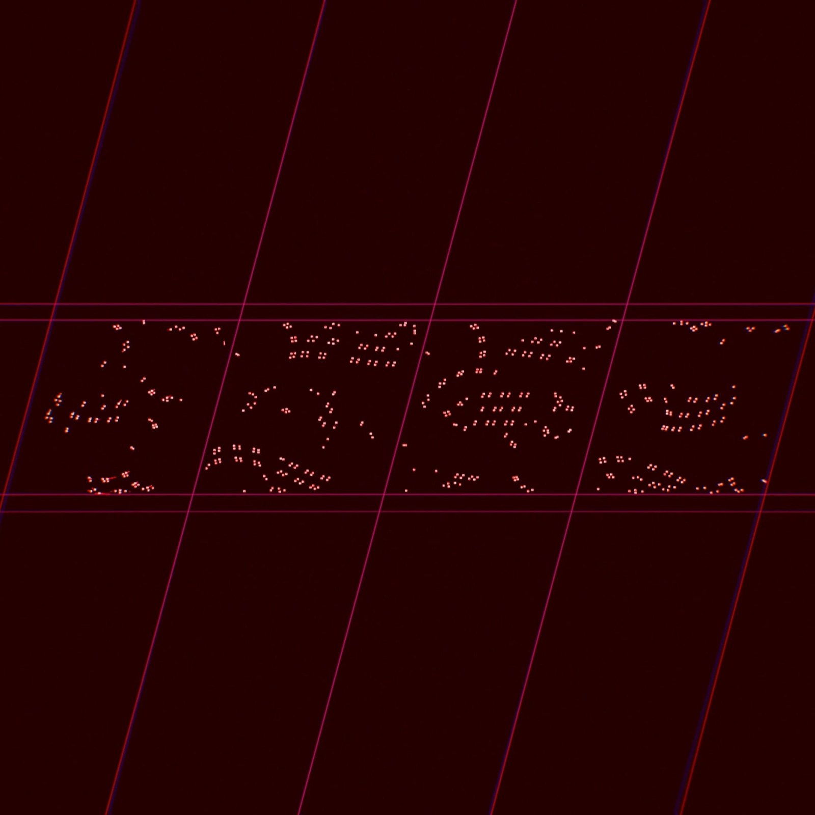
AbduzeedoProduction Type Unveils the Ciel Typeface
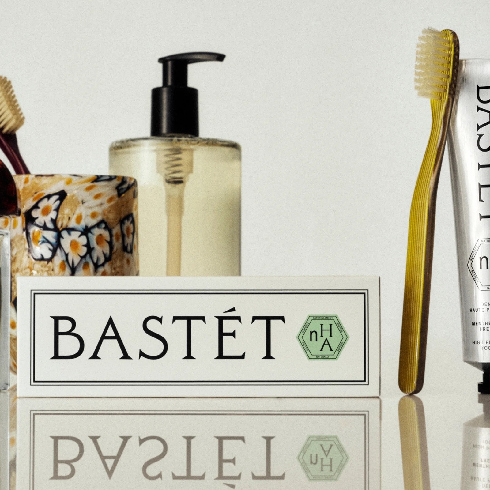
AbduzeedoBastét: Inside Wedge's New Oral Care Branding
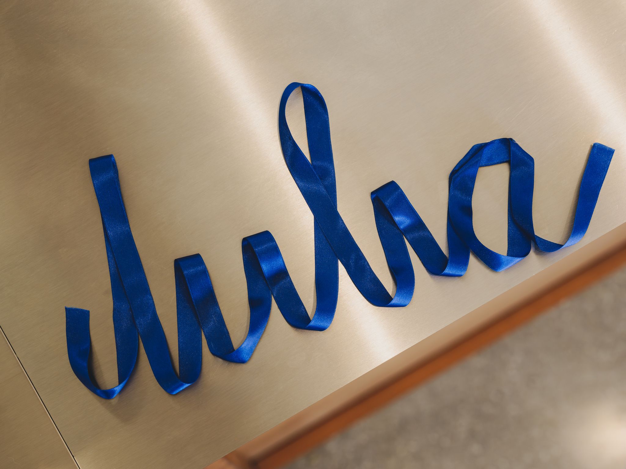
The DielineTour de Type: Vintage-Inspired Logotype, Satisfying Lockups, and a Brand Name Written with a Ribbon Another assortment of noteworthy typographic moments found last month, from wordmarks in projects we covered, to a title design for a book from the 80s.

It's Nice ThatAndrej & Andrej gives Pohoda Festival an identity refresh, complete with 3D babies and a futuristic typeface Pohoda Festival in Slovakia is like “a second Christmas” – but how many Christmases can you think of where you were overshadowed by two giant babies while listening to electronic music?
Design WeekSTUDIO HERRSTRÖM draws on car culture and carton typography for Milkshake rebrand Milkshake was established in 2019 to offer musicians an alternative approach to traditional recording contracts, operating simultaneously as a record label and an artist management firm.
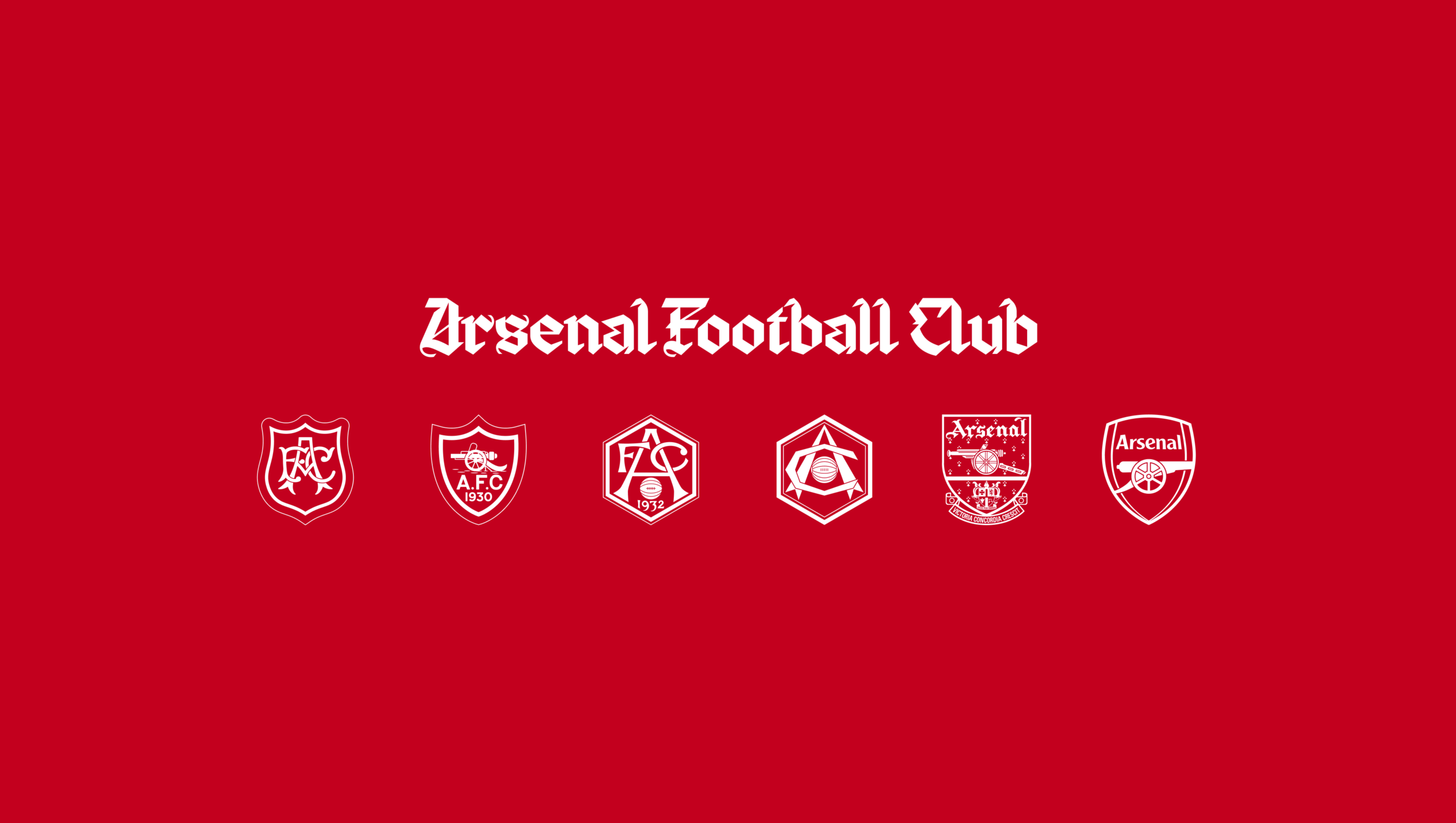
Creative ReviewArsenal unveils bespoke typeface inspired by a club legend David Rocastle was one of Arsenal’s defining players of the late 1980s and early 1990s, helping the club win the old First Division title in 1989 and 1991.

It's Nice ThatDavid Rudnick on the “borderline impossible” process of designing a bespoke blackletter typeface for Arsenal For the past four years, the designer has been building a hand-drawn, three-weight type family that pays homage to one of the most beloved players in Arsenal’s history: David Rocastle.
Morisawa
MorisawaJapanMorisawa Fonts Webフォントの無料トライアル参加企業を募集~AIエージェントを利用した体験も可能~ Morisawa Fonts Webフォントの無料トライアル参加企業を募集~AIエージェントを利用した体験も可能~

PRINTThe Lettering Artist Snooze is a Master of Type Experimentation and Process At a time when our modern culture is dominated by finished products and outputs (cough, cough—generative AI — cough, cough) the German lettering artist who goes by the nom de plume Snooze , is all…
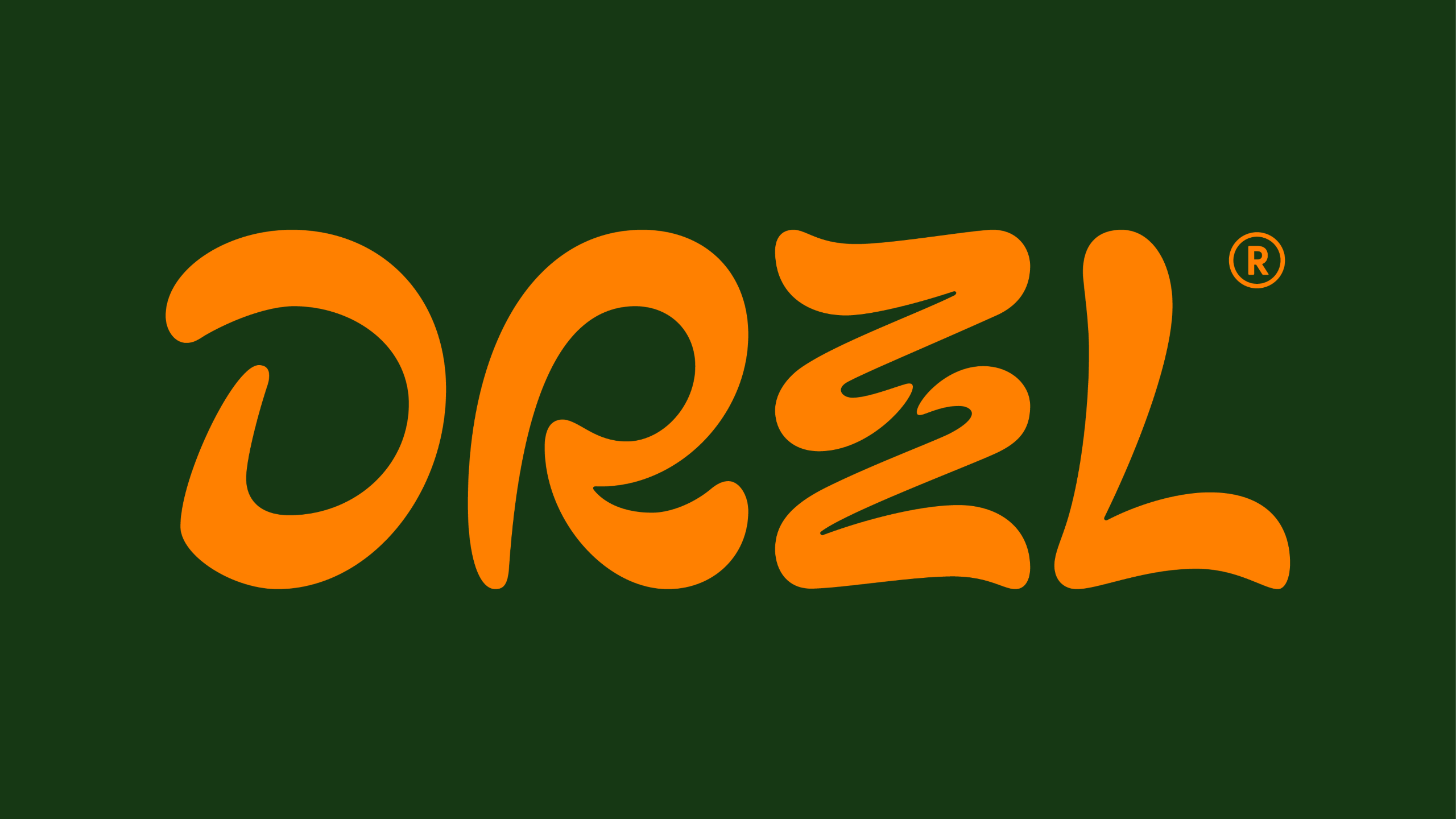
Design WeekDerek&Eric bring bright colours and funky typography to the launch of DRZZL I’m not entirely sure what my Mum in Spain would think if I were to turn up and ask here what she thought of olive oil in a squeezy bottle.
ÉtapesLa bonne typographie est-elle devenue un luxe ? Koto vient de lancer CcType avec une ambition affichée : proposer des caractères de qualité à des conditions suffisamment accessibles pour les indépendants et les petites structures.

AlphabettesTikte Typeface
I Love Typography
I Love TypographySteven Heller’s Font of the Month: Zinkraft Read the book, Typographic Firsts Massimo Vignelli was canonically adamant that a contemporary designer only requires a handful of typefaces and should “trash the rest.” He was talking about five to…
I Love Typography
I Love TypographySteven Heller’s Font of the Month: Loopy Read the book, Typographic Firsts I once taught a research/writing class called “No Google” that lasted until it dawned on me that “Google” was indeed the research tool for the 21st century.

I Love TypographySteven Heller’s Font of the Month: Brutal Types Read the book, Typographic Firsts “Brutal” is such a nasty, albeit seductive, word. A quick visit to my desktop Oxford dictionary confirms that the adjective “brutal” is, etymologically speaking…
I Love Typography
I Love TypographyFonts in Focus: Evert Read the book, Typographic Firsts Welcome to another edition of Fonts in Focus, our under-500-word reviews of great typefaces. Today, we focus on a recent release from Kostas Bartsokas of Foundry5.
Nothing matches this filter yet.