PAGE online
Serifenlose Forley: Klar, eigenständig und alles andere als neutral
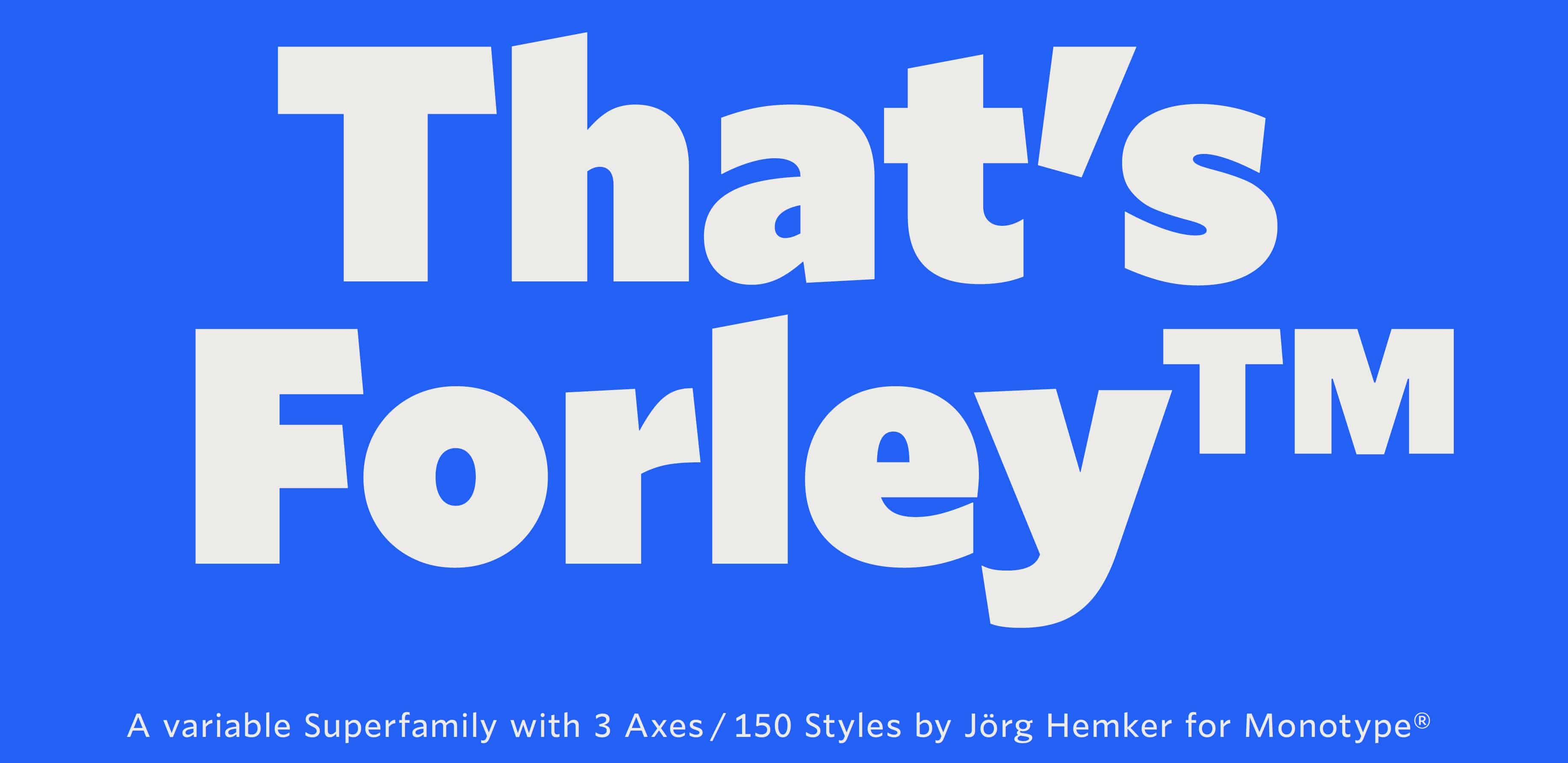
Was ist es eigentlich, was eine Schrift gut lesbar macht? Das fragte sich der Brand- und Typedesigner Jörg Hemker. Ergebnis seiner Überlegungen ist die große Schriftfamilie Forley.
PAGE onlineで読む ↗関連する記事
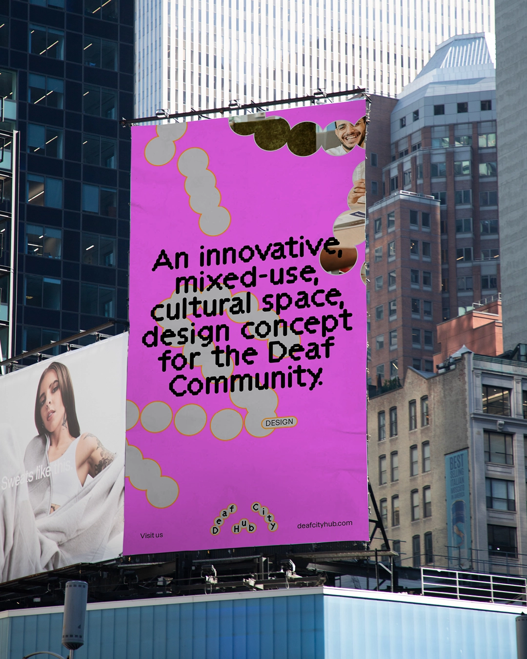
Asking which typeface DeafCity Hub used for its logo is entirely the wrong question Creative Boom

Hunter Harvey’s “text paintings” are graphic parodies where the typeface is the main character It's Nice That

No fonts on a dead planet: a website case study Design Week
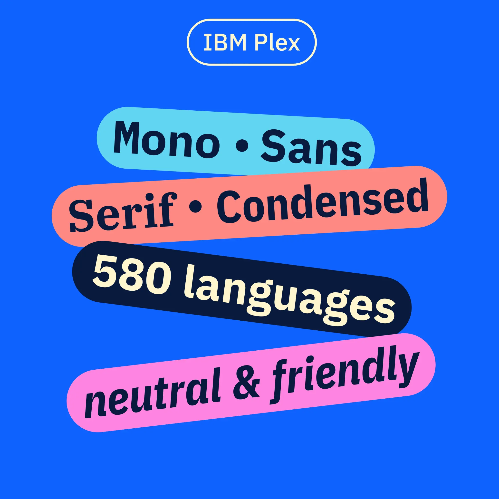
La bonne typographie est-elle devenue un luxe ? Étapes
Brands cannot afford to speak in the same voice as countless others right now. Typeface designers can help. Design Observer