The Dieline
Redken Bottles Up Its Vintage Lab Roots
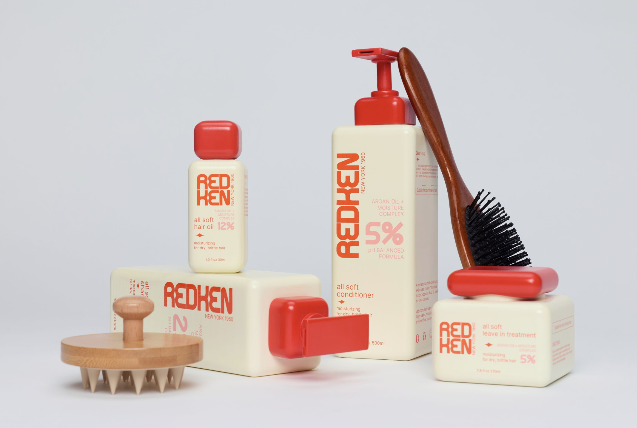
Redken’s concept rebrand revisits the brand’s scientific roots through vintage laboratory cues, squared forms and formula inspired details.
Read at The Dieline ↗Related
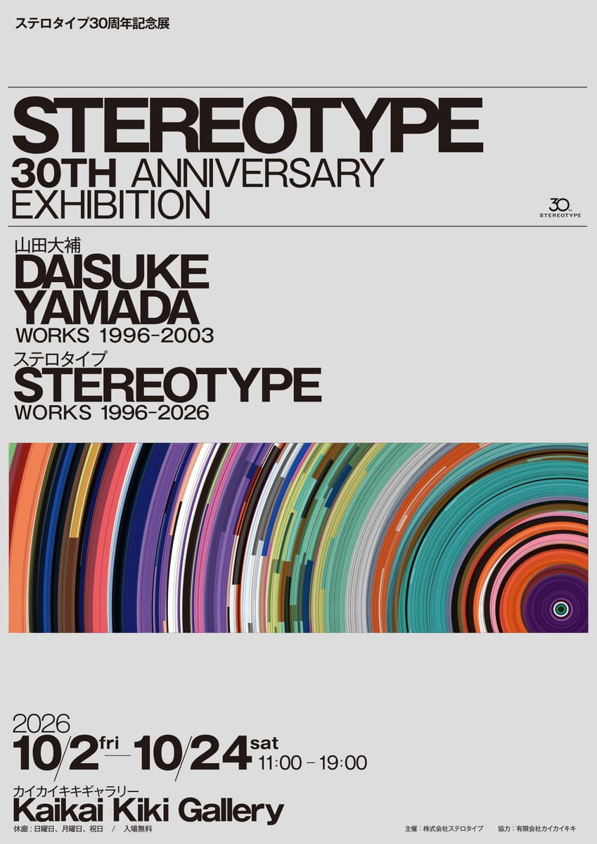
Japanステロタイプ30周年記念展 Japan Design Net
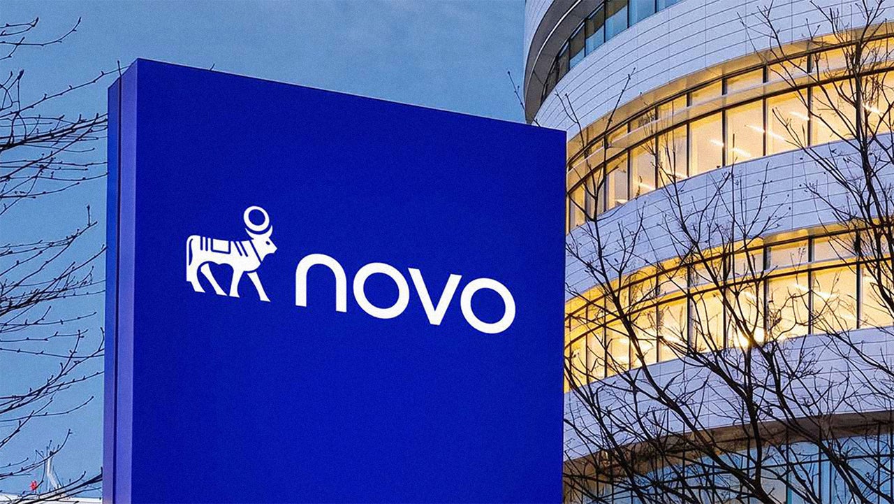
Does Novo Nordisk’s slimmed down rebrand signal a new era of DTC revivalism? Fast Company Design
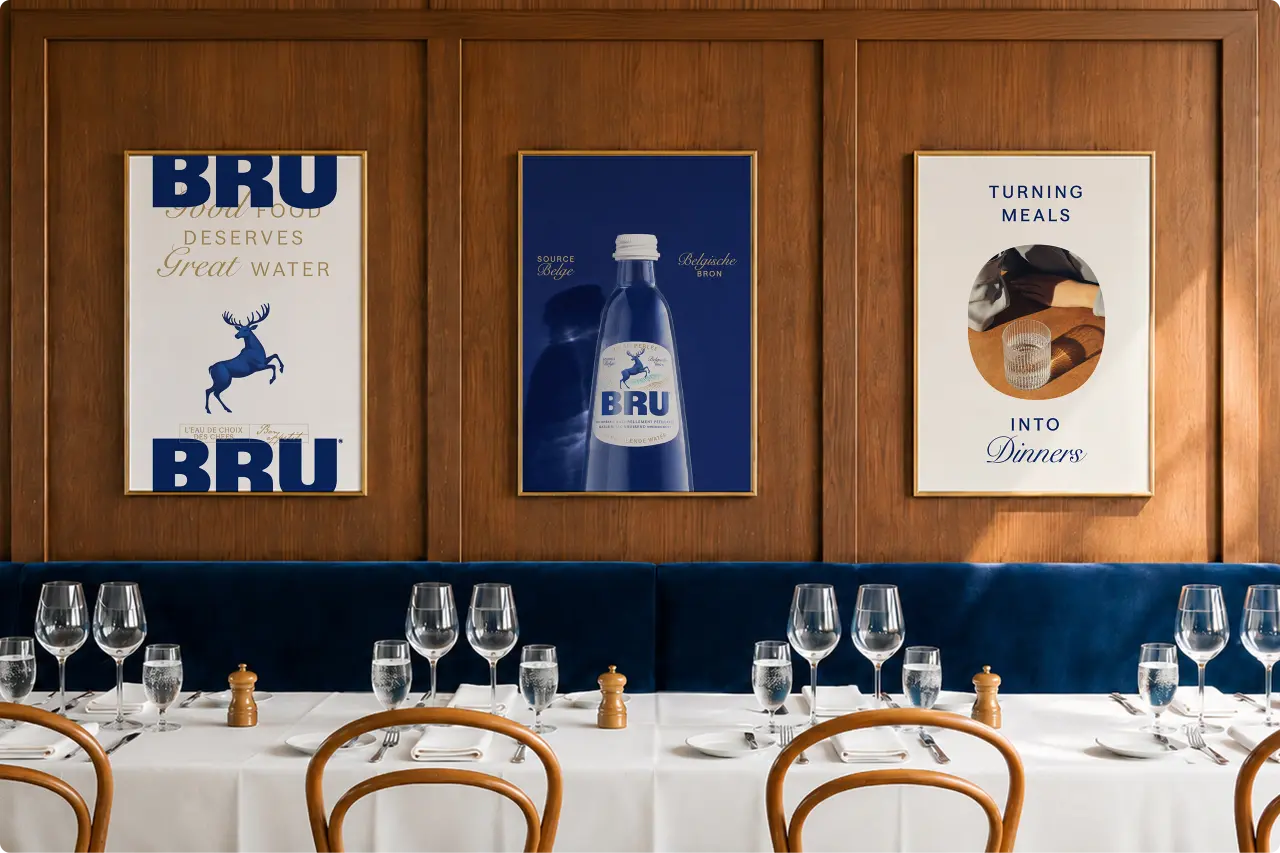
What this elegant redesign of a sparkling water brand teaches us about packaging in 2026 Creative Boom
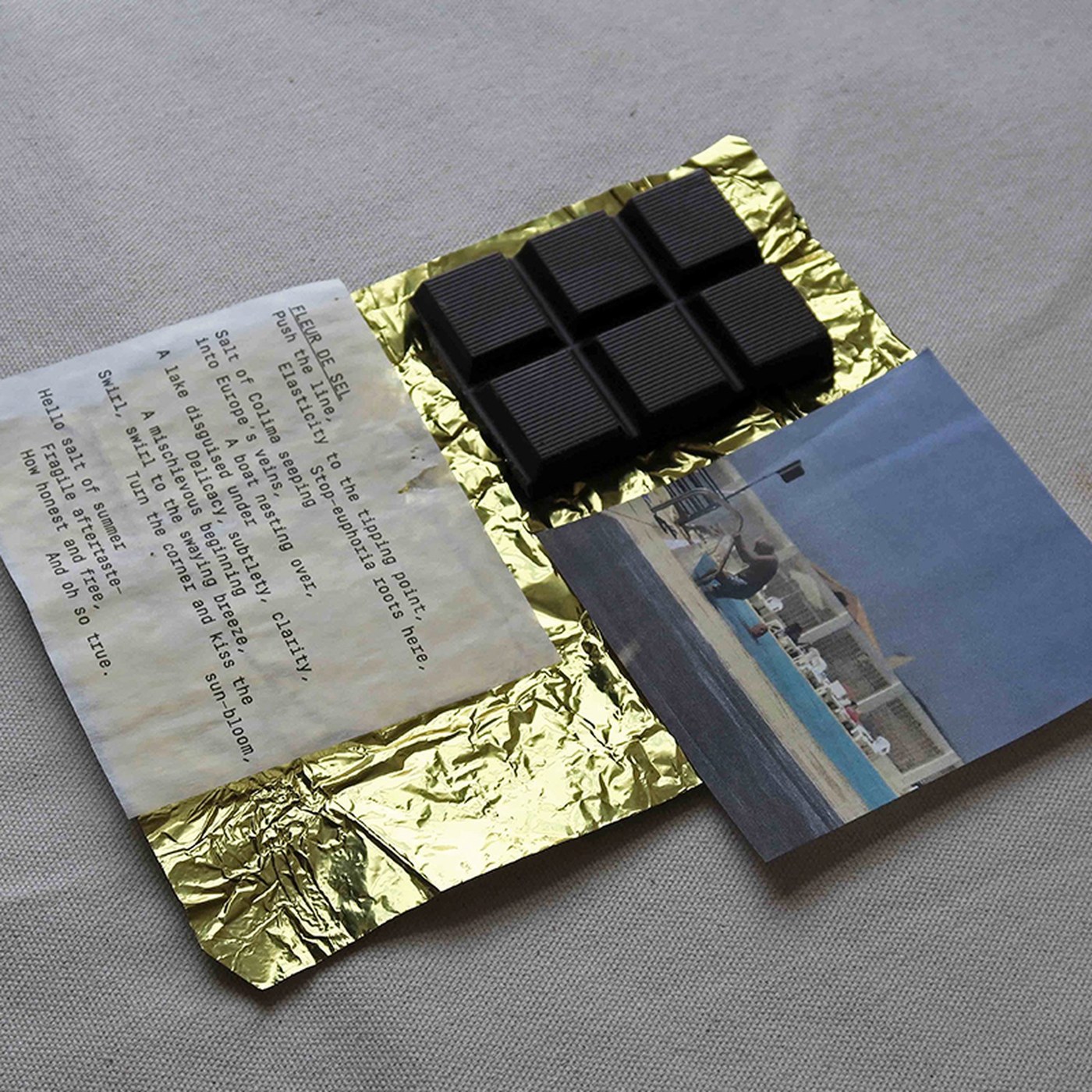
Packaging Design: Casa Bosques Chocolates by SAVVY STUDIO Abduzeedo
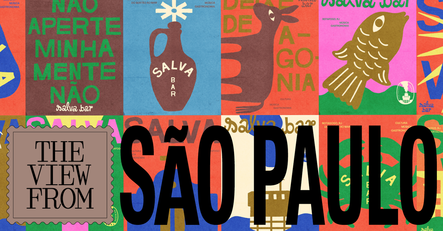
How retro branding is bringing warmth and fun to São Paulo’s bars and restaurants It's Nice That