PAGE online
Serifenlose Forley: Klar, eigenständig und alles andere als neutral
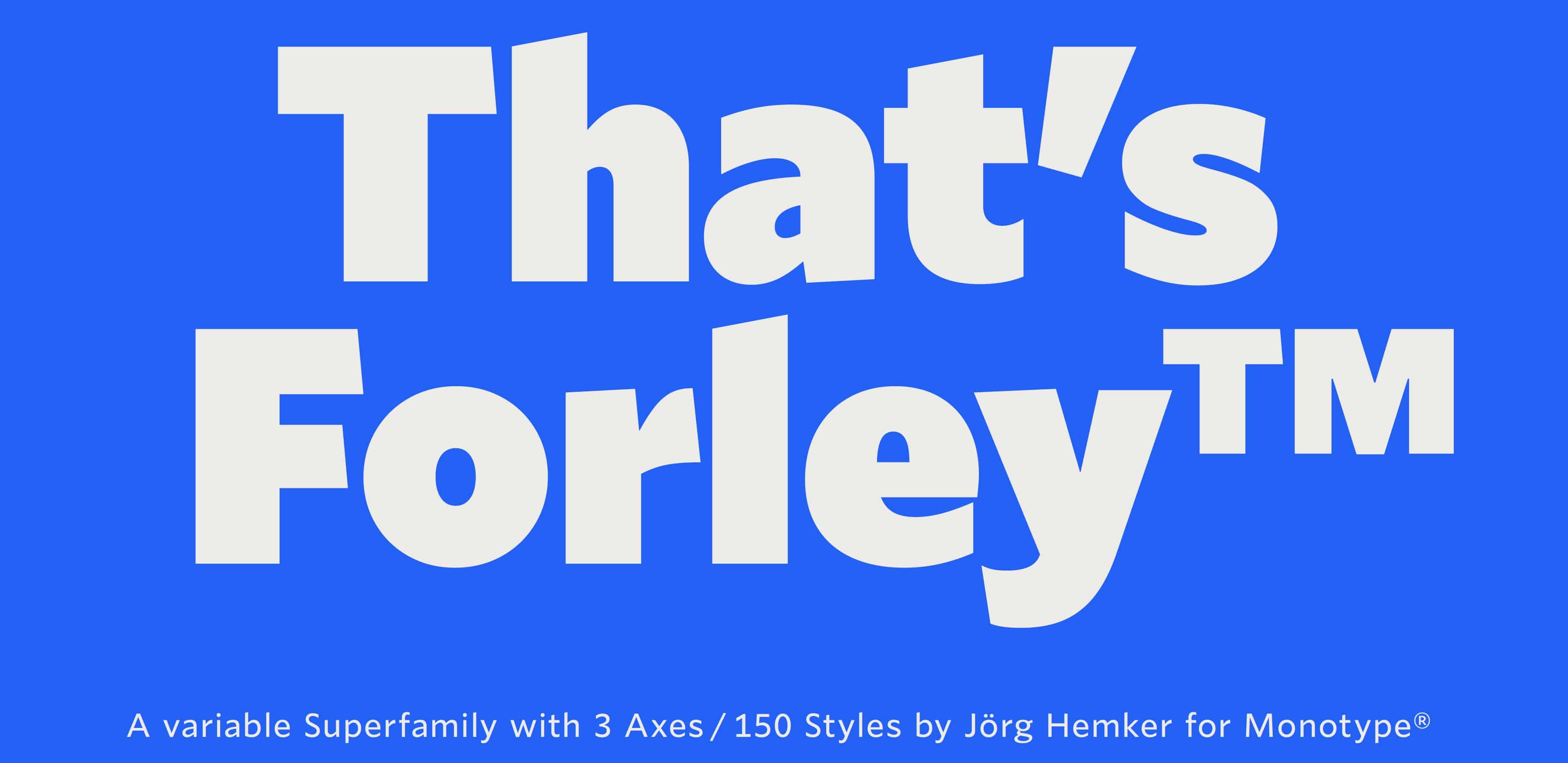
Was ist es eigentlich, was eine Schrift gut lesbar macht? Das fragte sich der Brand- und Typedesigner Jörg Hemker. Ergebnis seiner Überlegungen ist die große Schriftfamilie Forley.
Read at PAGE online ↗Related
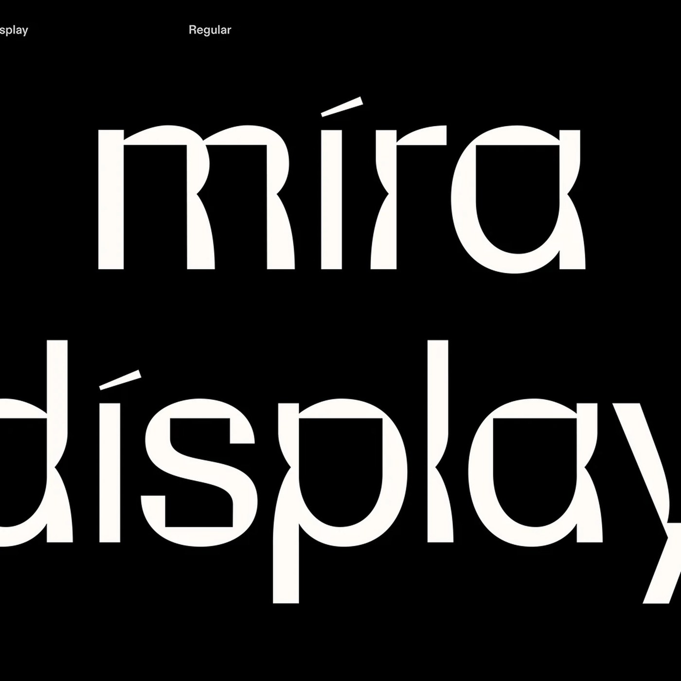
Typography Design: Mira Display by Mira Mayne Abduzeedo
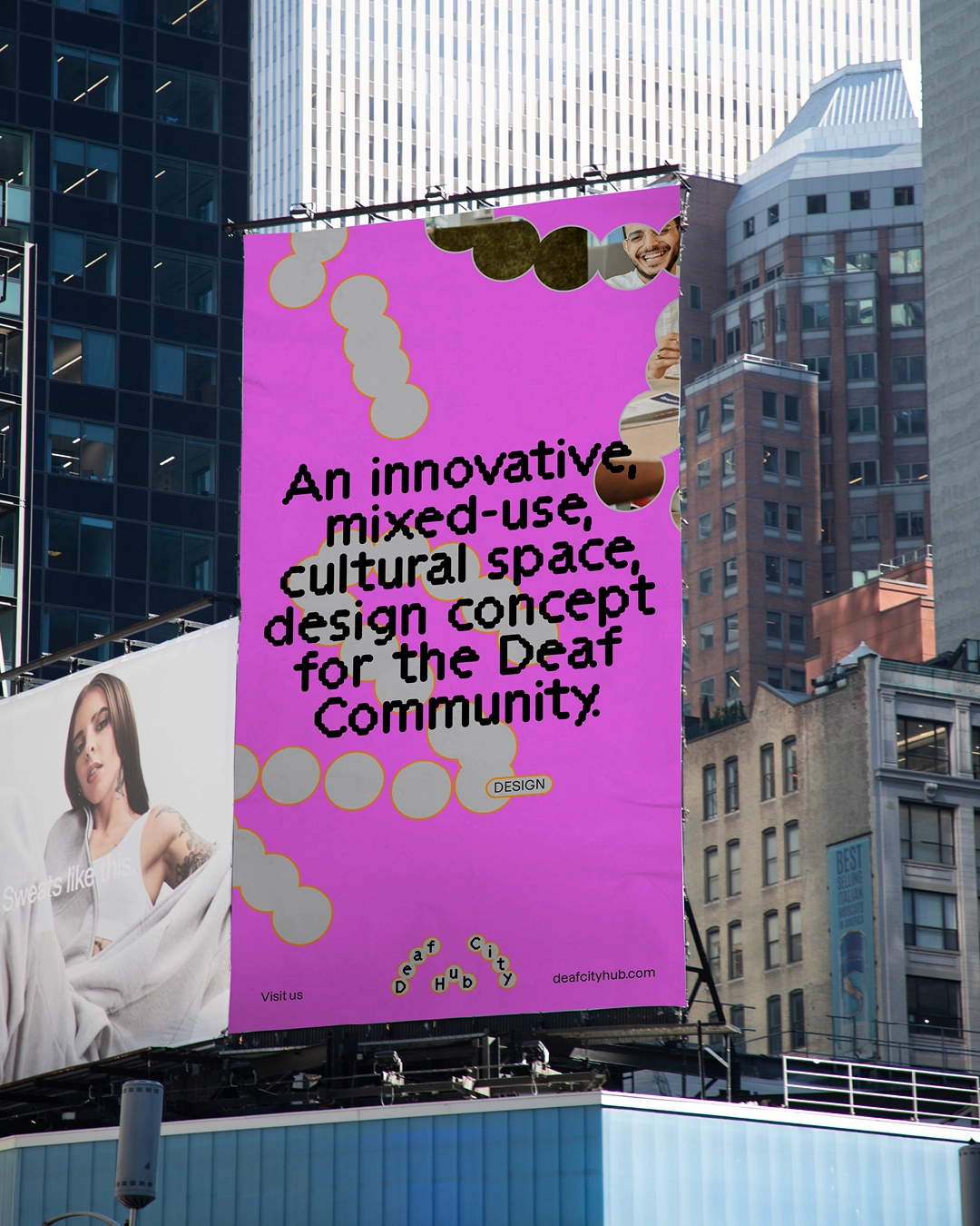
Asking which typeface DeafCity Hub used for its logo is entirely the wrong question Creative Boom
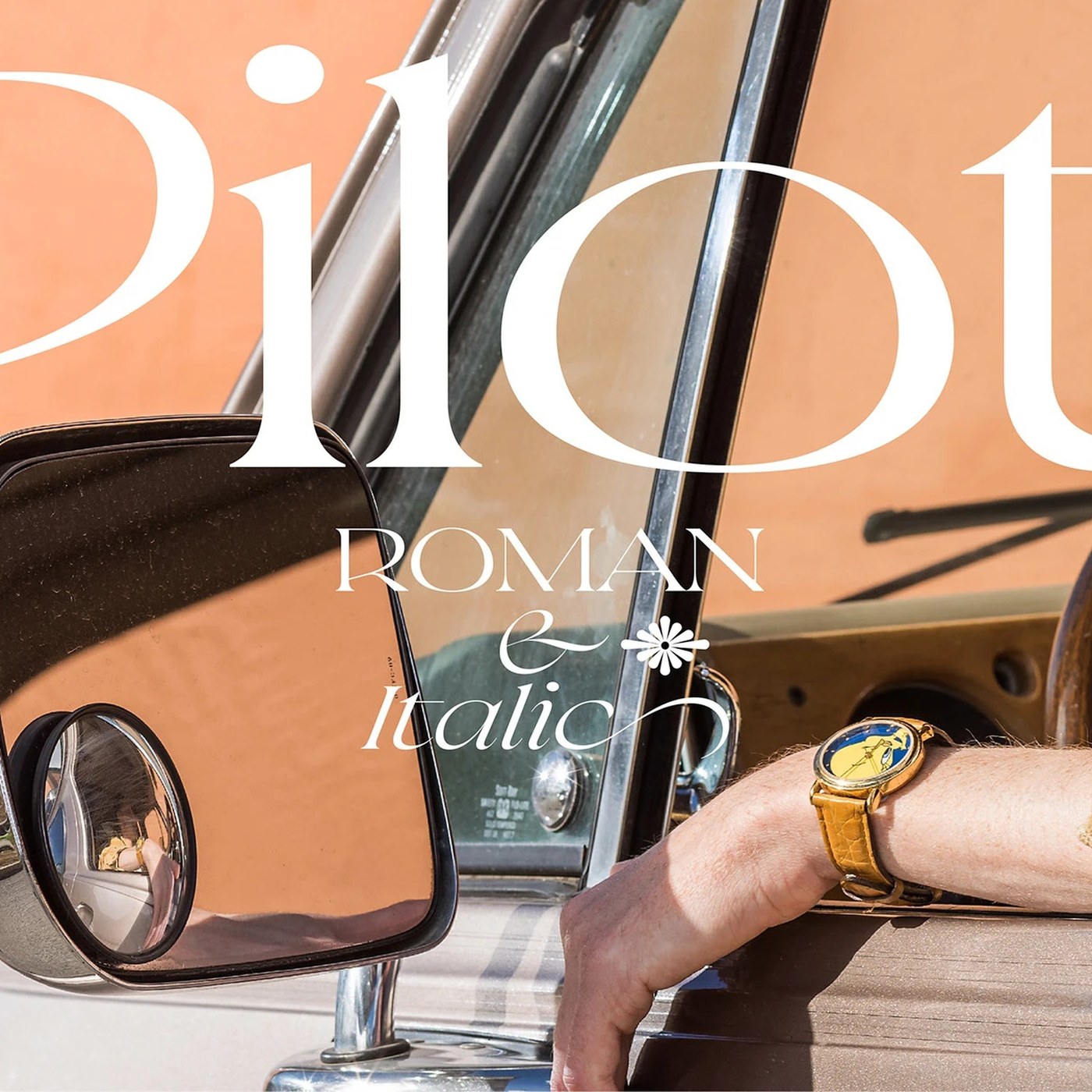
Typography: Pilot Typeface by Violaine & Jeremy Abduzeedo
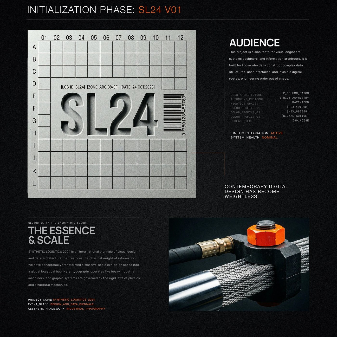
Brutalist Typography: SL24 by Kseniya Artman Abduzeedo

Hunter Harvey’s “text paintings” are graphic parodies where the typeface is the main character It's Nice That
