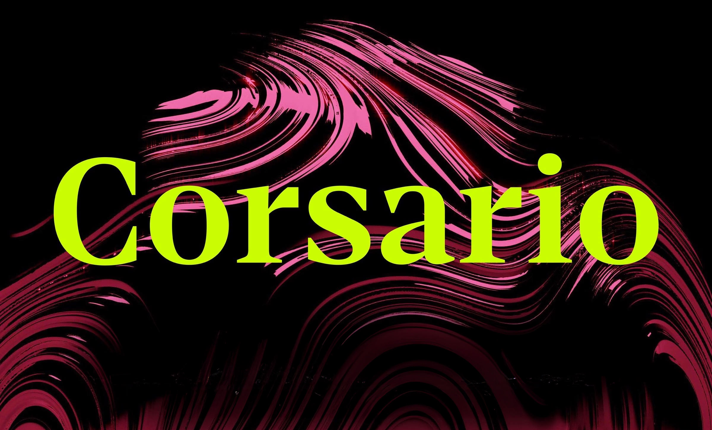
It's Nice That
Swirls, beads and Art Nouveau roots: Emily Klaebe on type design as world building

Inspired by subway tiles, mosaics, snail shells and lollipops, this designer uses typography as a way of creating microcosms of larger ideas which expand how typography lives.
It's Nice Thatで読む ↗関連する記事

Horah Inc lets its love for Pokémon and typography soar in identities for spiced rum, trading cards and book design It's Nice That
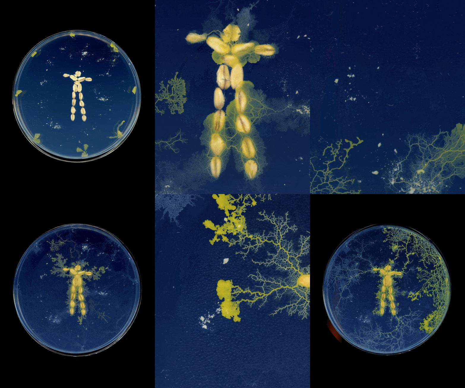
Logos and glyphs grow out of agar and grapevines in Emi Takahashi’s graphic explorations of living forms It's Nice That
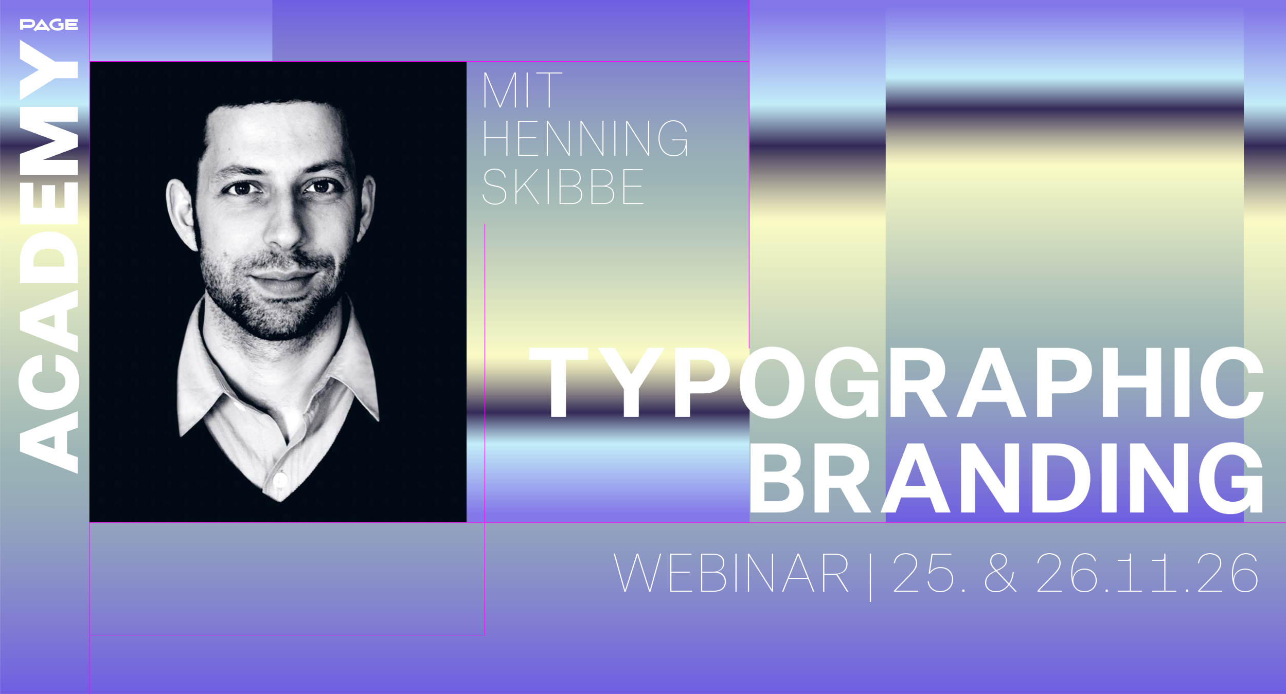
Masterclass »Typographic Branding« mit Henning Skibbe PAGE online
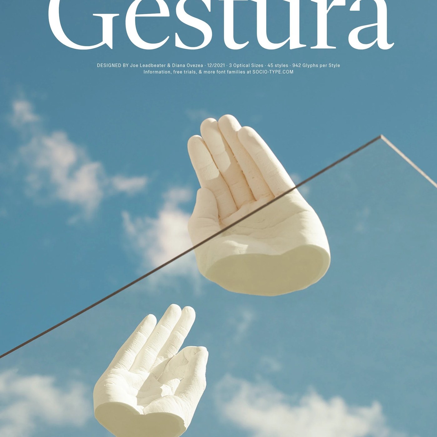
Sociotype Foundry Unveils Gestura Typography Design Abduzeedo
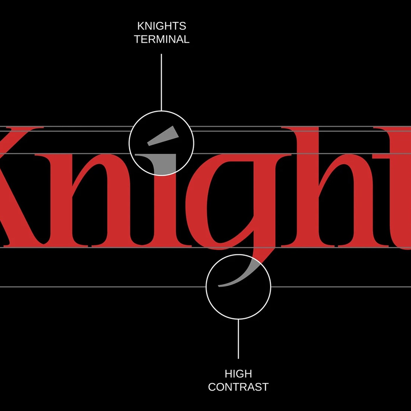
Typography: Knights & Fighters Typeface by Noodle Wang Abduzeedo