It's Nice That
Perfection, begone! Laura Pappa and Tüpokompanii’s new typeface is all about letting yourself be bad at something
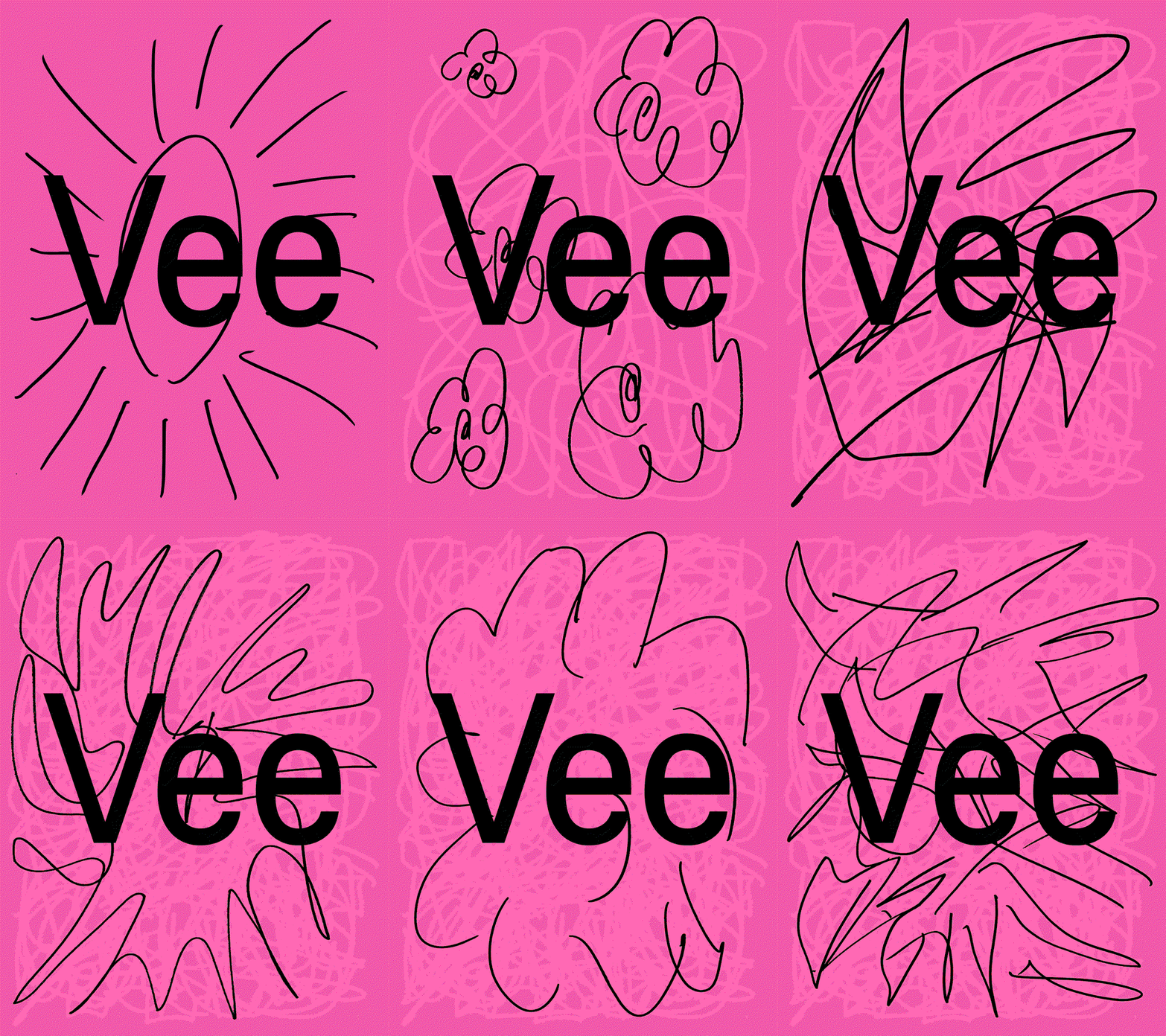
When the foundry set out on this typographic revival, they knew something would get lost in translation – so they chose to embrace it, and the results are much more interesting.
Read at It's Nice That ↗Related

How Love And Money designed the identity and tiny typeface for Tame Impala’s synthesiser brand, Orchid It's Nice That

Swirls, beads and Art Nouveau roots: Emily Klaebe on type design as world building It's Nice That

Horah Inc lets its love for Pokémon and typography soar in identities for spiced rum, trading cards and book design It's Nice That
Juri Zaech Unveils Fraktion Mono Typography Abduzeedo
Mehr Monotype Fonts in Canva PAGE online